What's happened to government investment?

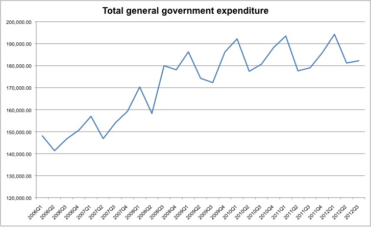
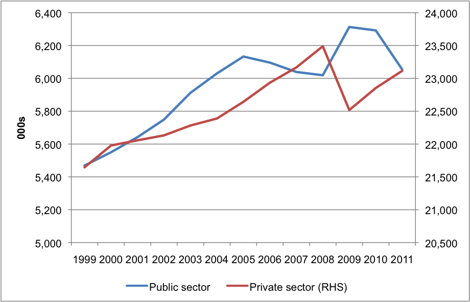
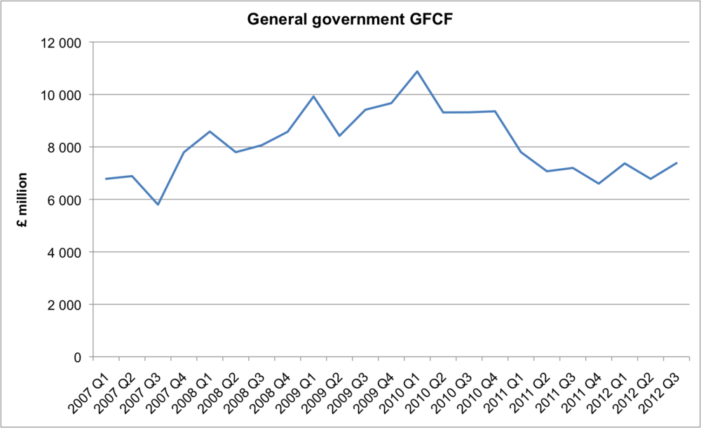
I'm not an expert on this data but I find spending figures as a proportion of GDP deeply flawed (since they're driven by implausible growth forecasts). So I've been trying to navigate the ONS website to find some raw figures on government investment. Here's two ways to look at it:

  • General Government GFCF - Table F of the national accounts (see here for a guide to using the national accounts, and here for our comparison of General government and private GFCF).

  • Public Sector Net Invesment (excluding financial interventions) - Table PSFN1 of the Public Sector Finances (see here for Sep 2012). If anyone knows how to download these figures in Excel, please let me know!


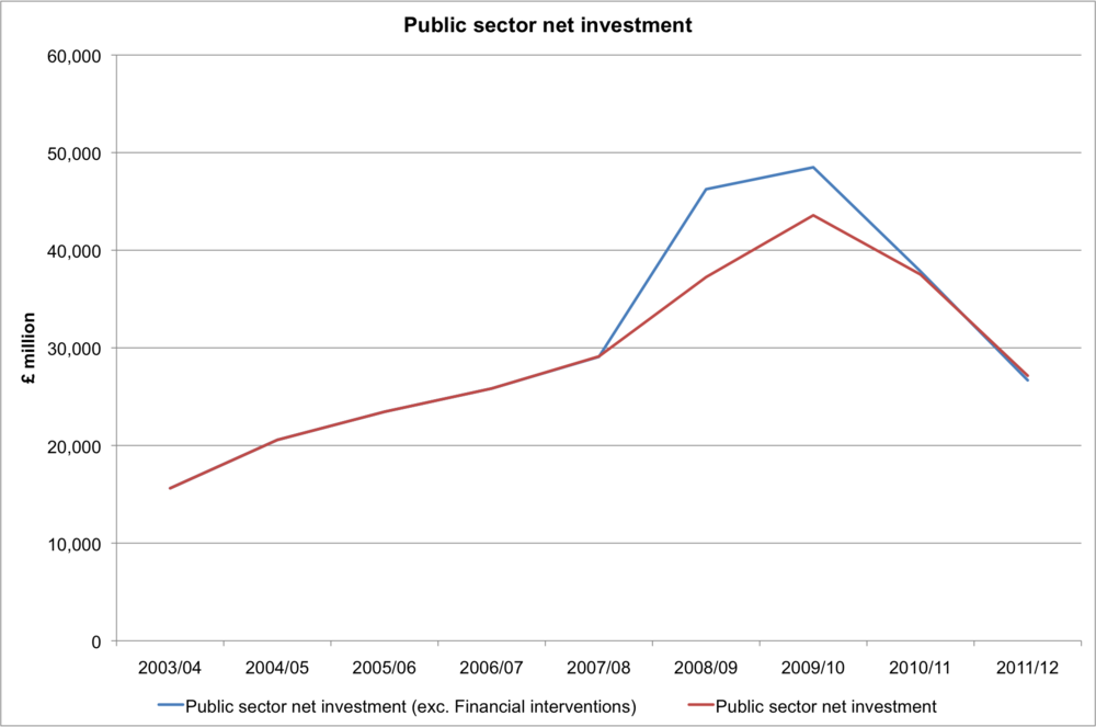
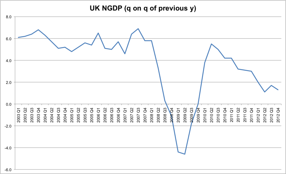
The point I'd make is that the dramatic cuts seen made by the coalition government (i.e. from 2010 onwards) are only "cuts" relative to the time of the fiscal stimulus of 2009. When Keynesian economists advocate fiscal stimulus they are arguing for temporary deficit financed spending. Therefore by definition a stimulus will be "withdrawn" at some point in the future. The argument against a stimulus is that it may be withdrawn prior to the economy recovering. If you say "don't withdraw it until the economy recovers" then to what extent is that a temporary programme? And both sides would acknowledge that all else equal, the higher the existing debt level the more dangerous a "permanent" fiscal stimulus is. Let's not also forget that part of the 2009 fiscal stimulus brought forward capital spending due to take place in 2010-2012. It's like me asking to be paid 2 weeks early and then in a fortnight time complaining about having a pay cut. 

I'd love someone to point out errors in my interpretation and use of the data (in particular I'd love to find a stable link to these indicators). I just think that although analysis like this is far more sophisticated than my own, to only start looking at what's happened since 2009/10 is deeply misleading. Keynesians - you got the stimulus you asked for. If you want another one I'm willing to debate that. But you can't simply pretend that the first one never happened!

UK quarterly NGDP

I've just been taking a look at the second estimate of GDP. Here's what quarterly NGDP looks like (compared to quarter of previous quarter). 

Series code: IHYO.

It's becoming increasingly hard to argue that expectations should switch to a new lower NGDP growth rate, rather than policymakers should ensure that NGDP reflects estasblished expectations. For more see Britmouse.

P.S. Here's the forecast YOY growth of NGDP from the March 2012 OBR report:

Can we measure uncertainty?

Last week saw the 7th quarterly meeting of Kaleidic Economics, and the theme was uncertainty. The report is available here. In it, we argue that attempts to measure uncertainty have insurmountable methodological flaws, but that doesn’t mean the Austrian school cannot contribute to a contemporary and progressive research agenda. In particular, we pose several questions relating to how "regime uncertainty" can be operationalised:

  • To what extent is regime uncertainty an extreme form of policy uncertainty? At what point do policy changes threaten the “regime”?
  • In terms of tax reform people tend to like changes provided they are anticipated. Very few people want the tax code to stay the way it is. Therefore stability is less important than predictability. Therefore can policy changes reduce uncertainty, provided they’re communicated clearly and help form expectations?3
  • Regime uncertainty is typically applied to the US economy during the Great Depression, and the “Great Recession”. It’s also been applied to the UK economy. On the surface, one would expect it to be especially pronounced during coups and other radical constitutional changes. It would be interesting to see cross country comparisons and detailed case studies
  • The basic idea is that a stable investment climate is important in generating confidence. But what if the present investment climate is inhospitable? To what extent can regime uncertainty lead to good economic outcomes?
  • Is it the uncertainty that’s the problem, or the prospect of worse economic policies? In crude terms can we compare regime uncertainty with regime shittiness?
  • Uncertainty doesn’t disappear when times are good, so what can we learn about the issue by comparing recessions with times of economic growth?
  • Does regime uncertainty mean that investors hold off on investment (this is argued by Bernanke 1983), or alter the types of investment they make? 

We also draw attention to measures of private investment, which we've updated:

Addendum: In the comments section Nicolas makes an important point about measuring regime uncertainty. It reminded me that I had intended to discuss this post by Lars Christensen in the report. Lars says,

My favourite source for a numerical measure of these uncertainties is the conservative Heritage Foundation’s Economic Freedom Index. We can use the sub-index for “Rule of Law” in the Economic Freedom Index as a proxy for “regime uncertainty”.

I think this makes a lot of sense, but I find it interesting to note that (i) this measure is only calculated on an annual basis; (ii) only exists from 1995; and (iii) "property rights" is on a 20 point scale so it doesn't change much. So I'm not sure how much help it is at assigning a causal role to regime uncertainty during recessions. For example, here's the "regime uncertainty" for the US since 2004:

Lars has some other great posts on regime uncertainty here and here (written by Alex Salter).


What is general government expenditure?

There is some debate at the moment about the most appropriate way to measure government expenditure. I've been especially interested in understanding the differences between the figures reported by HM Treasury, and those published by Eurostat. After several emails with the Office for National Statistics, I now understand where the Eurostat data comes from. This article provides an explanation.

General government expenditure can be found using the following steps: 

  1. Go to the ONS release for "Maastricht Supplementary Data Tables" (the most recent one is January 2013 and can be found here. As far as I can tell there's no stable URL for them so I would suggest entering "Maastricht" into the search box of the index page for all publications).
  2. Click on "Data in this release" in the top right corner.
  3. Download the excel file for "ESA Table 25 Quarterly Non-Financial Accounts of General Government Expenditure".
  4. Select Tab 2501 and look for the column "Total government expenditure" (possibly column T).

Here is a chart showing expenditure from January 2006 - December 2012:


Note that this measure of general government expenditure includes transfer payments, and it also includes the income from sales of goods and services. The latter are subtracted in order to generate Total Managed Expenditure (TME), a series that is not published by the ONS. 

The growth rate of MA halves

Apologies for not updating our data section as often as we'd like, but October figures are now out and show an interesting decline in the growth rate of MA, from +8% in July, August and September, to +4% in October 2012. M4ex continues to grow at a palsy rate of >4%, whilst the old measure of broad money, M4 continues to contract.


See here for more details.

Imagining an Optimal Language Area

Following the 5th Quarterly Meeting of Kaleidic Economics, we are releasing a report called "Imagining an Optimal Language Area". In it, we ask how the Euro has lasted this long; look at the legal implications of a Greek exit; contrast devaluation and deflation as misplaced panaceas; and discuss the possibilities for private money. 

We also use a chart to show some of the endgame scenarios, and reproduce the image below:

The resource cost of a gold standard

We are currently incurring costs akin to having a gold standard – in that we are using gold for monetary purposes, as an inflation hedge. But we don’t get any of the benefits. 

In my City AM column on September 4th 2012, I discussed the resource costs of a gold standard. This was triggered by reading Lawrence White's estimate that the benefits of a commodity standard outweigh the costs once inflation hits around 4%. Due to space constraints, the calculations were not included in that article. I thought I'd provide them here. The basic analysis is (White, 1999, p.42-50).

Following Friedman and White we first need to know the ratio of gold to money. This is equal to the typical reserve ratio (like White I used 2%) multiplied by the ratio of currency notes and demand deposits to M2 (52.7%), plus the ratio of coins to M2 (0.18%).

G/M = R + Cp/M = [(R/N)+D][N+(D/M)] + Cp/M

(Where R is bank reserves, Cp is gold coins held by the public, M is M2, (R/N)+D is the ratio between gold reserves and demand liabilities, (N+D)/M is the ratio of notes and deposits (but not coins) to M2).

Assuming the marginal reserve ratio is equal to the average reserve ratio, the resource cost is equal to this ratio (1.2%) multiplied by the change in money supply that would keep the price level unchanged, multiplied by the ratio of M2 to GDP.

ΔG/Y = (ΔG/ΔM) (ΔM/M) (M/Y)

I used 4% for the former (as a rule of thumb), and 176% for the latter (from the World Bank). All in this suggests that a gold standard would cost 0.085% of GDP, which amounts to around £31bn, or £512 per capita

Back of the envelope calculations, to be sure. I encourage others to give it a better stab.

Towards a NGDP futures market

Kaleidic Economics has been flirting with prediction markets since our launch. I have also been intruiged by Scott Sumner's proposal for an NGDP futures market (see this proposal for the Adam Smith Institute), and the impact this would have on the discretion of central bankers. As I said in my brief review for Money Marketing:

Targeting the level removes a large amount of discretion from the Bank of England. Monetary policy stops being an arbitrary policy lever and provides a macroeconomic foundation upon which economic activity can build. 

Some time ago I set up a prediction market for NGDP using Inkling Markets. Here are the details:

The main problem with this is the difficulty of finding NGDP figures for the UK. Britmouse provides this useful guide to UK GDP but my suggestion is to start off with Table A1 of the Quarterly National Accounts (published by the Office for National Statistics). It would be handy if there was a stable link for the most recent release, but the best I can find is going to "All releases of Quarterly National Accounts". You can then click on the most recent, and eventually "select series from this dataset". Table A1 has what you need.

I think that it's easiest to think of NGDP in terms of quarterly growth rates that are compared to the previous year. This was what I had in mind when I posed the question, and here are the components (the red and blue lines should sum to the orange one):

NGDP = Real GDP + GDP Deflator

IHYO = IHYR + IHYU

The chart below shows the composition of NGDP over the last decade.

You can also do this for annual figures (YoY change)

IHYM = IHYP + IHYS

Or quarterly figures (QoQ change)

IHYN = IHYQ + IHYT

As Lars Christensen rightly pointed out it is the level of NGDP rather than a particular growth rate that "market monetarists" care about. One of the downsides of NGDP targetting is that people tend to think in terms of growth rates rather than levels. But that can change. Therefore it would probably be better to focus on the level of NGDP:

The prediction market question should probably be in relation to this figure, therefore Kaleidic Economics will endeavour to update it on a quarterly basis as part of our data. The series code is YBEU. I'm open to suggestions for what that question should be - for example an annual figure on an annual basis? Or a quarterly figure on a quarterly basis? For now I've done the following trial:

Finally, for the absolute amount of NGDP: 

  • Table C1: Quarterly National Accounts - Gross domestic product: expenditure at current market prices = YBHA

 Other Kaleidic resources:

Thoughts on UK employment data

I've just received by email the following chart from Ewen Stewart, of Investec (source). It shows long terms changes in UK employment by sector.

As he points out, some of the striking features include:

  • The decline in Manufacturing 
  • The cyclicality of Retail, Construction, and IT & Comms
  • The structural increases in Health and Social Work, and Education

It certainly ties into the view that the UK economy has been shifting from a manufacturing to a strong dependency on public services. Finance and Insurance is minor compared to state funded industries.

The April 2012 Labour Market Statistics also provide some interesting insights. Table EMP13 shows employment by industry sector, and I wanted to see what's been going on during the "recovery". Unfortunately they only provide 3 years worth of data, so it doesn't help us compare the boom and the bust. This would be useful though, because Paul Krugman has argued that US employment fell in a balanced way across all sectors (I can't find the presentation online but it was very simlar to this(.pdf)). This would suggest that the recession is due to an aggregate demand shock.

For the UK, however, there are clear structural differences. Some industries are contracting, others are gorwing (and indeed quite strongly).

To see this in more detail I focused on the five biggest sectors (those that employ more than 2m people each) and what does it show? Massive falls in Construction, but clear differences between the different sectors. 

 I also wondered about Public vs. Private sector employment. Table EMP04 provides a breakdown, and I've just taken the absolute numbers (note that private sector employment is on the RHS, it is around 80% of total employment whilst public sector is around 20%).

It is likely that these numbers underestimate the scale of the public sector, because if a local council outsources cleaning to a private contractor, for example, this will be treated the same as people switching from public to private provision of goods. We see a large increase in public sector employment from 1999 - 2005, and this isn't simply because it's growing from a lower base. During this period public sector rises from 20.2% of total employment to 21.3%. But the ratio then inverts with (relatively) high private sector growth just prior to the financial crisis.

The fiscal stimulus of 2008 led to a spike in private sector jobs, but most of those have now been reduced. This is exactly what a "stimulus" is supposed to do in theory - provide a temporary boost. But it seems odd that people complain about falling public sector employment, now that we're 4 years after the stimulus. It's impossible to continue that temporary growth permanently. In reality what we see is the failure of that policy. At the very least, the unwinding should be treated as part of the costs.

Austerity and the passage of time

Following the fourth meeting of Kaleidic Economics, we have released a report on the UK's austerity plans. Three main arguments are made:

  1. Temporary changes in the tax code are inconsistent with both sides of the debate
  2. We cannot ignore the historic state of the UK economy when discussing fiscal policy
  3. Alternative forecasts for GDP can make a dramatic difference to austerity measures

This chart shows government spending as a proportion of GDP, using a GDP forecast lower than the official OBR figures. It reveals that government plans to reduce spending are based as much on over optimistic growth forecasts as they are on actual spending cuts.

You can read it in full here (.pdf).

Quarterly Report No. 3 released

Following the March meeting of Kaleidic Economics we have released the 3rd Quarterly Report. The topic is the economic development of China and how it fits into business cycle theory. We identified and discussed the following key questions:

  • What is the right historical parallel?
  • Are GDP figures accurate?
  • How much growth is due to a housing boom?
  • Does economic growth translate into raised living standards?
  • Where are the brands?
  • Will China democratise?
  • Can policy errors be exported?

You can download the report here.

A comparison of monetary aggregates

The image above shows a range of measures of the UK money supply. Because of the scale it is hard to make out changes in any given measure, but the purpose is to see how they relate to each other in terms of scale.

It demonstrates how MA (in blue) is a narrow measure that incorporates more deposits than M1. I was surprised that M4ex is smaller than M2. We have also been playing around with a very broad measure, which is shown as MB. More news on that soon.

Update: the previous version used an area chart and showed the cumulative money stocks. We've now changed it to just show the money stock per measure (2/3/12)

Important updates to MA compilation

In January 2012 we made some important updates to our measure of the money supply (MA). These were primarily an attempt to simplify the compilation and ensure that the series we were using were compatible across various reporting institutions. Whilst the previous measure used various asset classes from the Bank of England's Divisia tables as the starting point, the new measure is simply defined as:

MA = Currency + Demand deposits

MA is really a measure of the money stock, as opposed to the money supply, and the chart below shows the total amount for as far back as the Bank of England data goes (Janaury 2010).

The chart below shows the difference between the growth rates in the 2011 measure of MA and the 2012 measure. This is obviously a major difference since the new compilation method is now pointing to a steadily increasing rate of monetary expansion, as opposed to a continued monetary contraction. We will continue to look into these issues and provide updates.