In his 1994 RAE homage to Arthur Marget, John Egger invokes the image of a price "swarm", as opposed to an overall level.
[t]here is no logical reason why a picture of changes in the height of a given "swarm" could not be obtained by simply plotting the individual prices in such a "swarm", and then generalising concerning the movements of the "swarm" on the basis of the picture of the movement of individuak prices thus obtained (1942, p.333)
I'd hoped that the Billion Prices Project would utilise some awesome Gapminder style visualisation tools to bring the swarm to life, but so far I've not seen any attempts. I was looking at the April CPI data though and figured I'd plot the breakdown. The chart below shows the all 12 inflation sub indices from Feb 2016-March 2017 (2015=100). The overall CPI level is shown as a line:
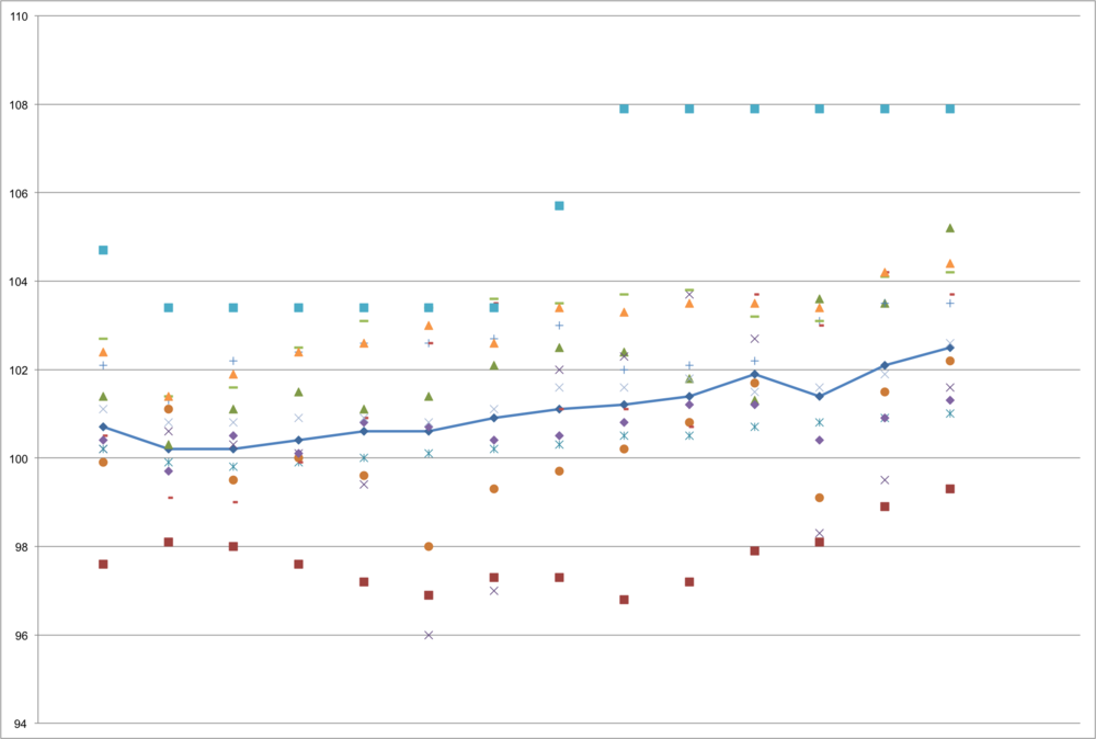
It's a start.