MA has been a work in progress for some time, and so the usefulness in terms of telling a distinct story to other, alternative monetary aggregates, also changes. When I present the current version (but using data as of December 2013) I point out that it's roughly the size to M1. And indeed from 2009-2013 the growth rates have been pretty much the same. Which begs the question as to whether it has any additional explanatory power.
The chart below shows MA vs M1 growth going back even further though, and you can see some major differences. In particular in early 2008 MA started to contract however M1 growth skyrockets.
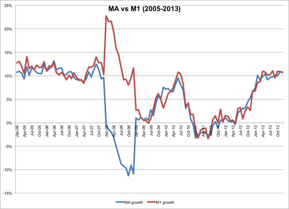
Given that my motivation for pursuing MA was that traditional aggregates weren't demonstrating a monetary tightening during the 2008 credit "crunch", this is an important point of difference. The trouble with narrow measures are that they are susceptible to reclassifications and data adjustments. That's probably what we're seeing here, but it's also evidence that MA and M1 tell different stories.