Natural interest rate estimates make the Daily Telegraph

Pete Spence has written an excellent article on natural interest rates in the Daily Telegraph. He says, 

The crisis came at an inconvenient time for policymakers. For the past two decades the so-called “natural rate” had been been trending downwards. This is the theoretical rate which best promotes growth and simultaneously keeps inflation in check. It has been a source of much debate among economists.

He goes on to cite the Kaleidic Economics estimates of the UK natural rate.

My intention is to update this on a regular basis and publish it on our Data page. It looks like there is some interest in this, and so I will focus efforts on providing it. This is great coverage, and especially encouraging that debate is moving in this direction.

Total Output grew by 2.17% in 2012

October 31st saw the belated release of the 2014 Input-Output Supply and Use Data. This is important because it incorporates a larger amount of economic activity than GDP data, but comes at the cost of only appearing as an annual series, and with an 18 month (or longer) lag. The diagram below shows the breakdown of the measure for 1997:

I've previously mentioned that Gross Output data is now an official BEA statistic, and I am interested in seeing equivelent figures for the UK. Here they are.

Firstly, in terms of absolute numbers, we can see that Total Output dwarfs Nominal GDP. 

In fact Total Output is around twice as large as Nominal GDP:

The reduction in the ratio that occured in 2002-2005 is a result of Nominal GDP growth running ahead of Total Output growth. But notice the dramatic increase in the ratio in 2006. This was because Nominal GDP was growing at 5.81%, whilst Total Output grew at 8.73%. This reveals that economic activity was running at a significantly higher pace than a focus on GDP data was telling us:

One of the main reasons why the September revisions to GDP had such an impact was because of a reclassification of R&D spending. This rests on a conceptual problem with distinguishing between investment and intermediate consumption. As more and more economic activity becomes service based we might expect this problem to grow over time. One of the chief benefits of using a broader measure of national income is that it captures all intermediate consumption, and therefore the boundary between intermediate and final consumption/investment becomes less relevent. 

These figures reveal that in 2010 and 2011 the wider economy was growing at a higher rate than that being measured by GDP, and in 2012 they were effectively the same. It is very difficult to read much into these annual growth rates, given that there is likely to be a lot of quarterly volatility. But in the same way that the US have started releasing this as a quarterly series, there would be much to gain from the ONS doing likewise.

The Bank of England annoy me

I'm in the process of writing a guide to UK monetary policy, and thought I'd take a look at the material the Bank provide for participants of their Target 2.0 competition. In it's explanation of the cause of inflation, it says,

But what happens if there is an increase in demand for some reason, for example due to a reduction in income tax, or because consumers suddenly feel more optimistic and start spending more money rather than saving? 
Emphasis added. It also has a section on "components of demand":
• Consumers’ expenditure – spending on goods and services by households in the United Kingdom;
• Capital expenditure – investment in buildings and new equipment;
• Expenditure on stocks of goods – spending by firms on increasing their inventories of goods and materials;
• Government expenditure – spending by central and local government on health, education and other public services;
• Expenditure on exports – spending by foreigners on UK goods and services; and
• Expenditure on imports – spending by UK residents on foreign goods and services.
But MV=PY. Instead of looking at the breakdown of demand, what about considering the actual cause of changes? They go on to say,
The ultimate cause of inflation can really be said to be central banks, like the Bank of England. Their behaviour and actions determine whether inflation is allowed to rise or is kept low – in other words, whether they allow prices to rise unchecked by monetary policy, or whether the central bank seeks to influence the amount of money in the economy.
But even here it's implied that the Bank's only culpability with regard to inflation is a failure to perfectly offset external shocks. I just find it frustrating that when the Bank of England are attempting to give examples of increases in demand, they provide vague examples rather than something like the following:
But what happens if there is an increase in demand because of an increase in the money supply
I can't tell if they are implying that changes in monetary aggregates are not a cause of changes to demand, or if they take it as given that the Bank of England isn't a source of demand shocks. It's a shame that part of the Bank's efforts to educate the public is in fact a marketing exercise to absolve them of responsibility for macroeconomic blunders.

First glance at MAex

The recent update to the MA compilation method revealed a sudden reduction in the growth rate. However this was driven by a mysterious "improvements in reporting at one institution", which saw £85bn vanish in January 2014. I made a shadow M' series which added this back in, but that's not ideal.

I've just tried an alternative response, which is to strip MFI deposits from the measure. We can call this MAex, and here's the series from April 1991:

If you want to see a more recent look, here it is from January 2001:

I'm continuing efforts to improve the measure.

Estimating Multi-Factor Productivity

In my post on neutral interest rates I mentioned productivity figures. I wondered whether the reason the estimate of the (real) neutral interest rate of 1.8% (which is implausibly high) is a function of (i) using the wrong productivity measure; (ii) the problems with UK productivity measures. Labour market productivity is released each quarter, but ideally we want to use MFP.

The closest I've come is a January 2014 ONS estimate of MFP. It's labelled "experimental" but at least provides annual data from 1997-2012. It looks like this:

If anyone is aware of quarterly estimates, I'd be interested to know.

The neutral interest rate is currently 1.8%

Having begun with such a confident headline, the rest of this post will involve a lot of backpeddling. For many economists (not just Austrians) the Wicksellian rate of interest (or "natural" or "neutral" rate) is of central importance for macroeconomic stability. In fact, one might argue that it isn't merely an indicator of the monetary stance - it is the stance.

Indeed David Beckworth and George Selgin argued this in a 2010 working paper. This morning I thought I'd attempt to make a very rough estimate of what interest rates would be in the UK - if they were at their natural rate. Their method is based on a Ramsey growth model that says that the neutral rate of interest is a function of productivity growth, population growth, and time preference. For simplicity, they focus on the component that is likely to be most volatile - productivity. Their equation for their estimate of the neutral rate is as follows:

In other words, the neutral rate today is equal to the long run steady real interest rate, plus the difference between expected Total Factor Productivity Growth, and the long run average TFP growth rate.

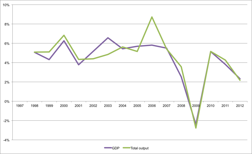
Following them, I assume that the long run steady real interest rate is 2%. For the productivity figures I used the quarter on quarter growth rate of output per worker (series code A4Y0). I then calculated expected TFP using the following approximation of an exponentially weighted moving average:

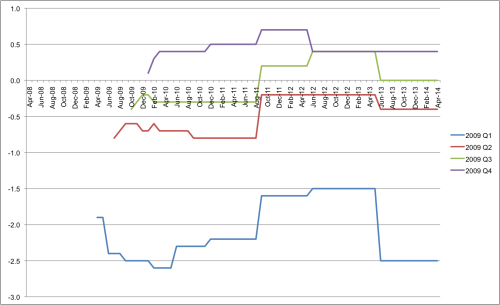
Again, following Beckworth and Selgin I set the coefficient at 0.7. The output is as follows:

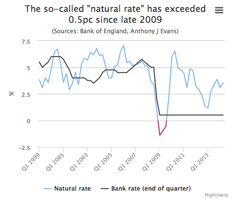
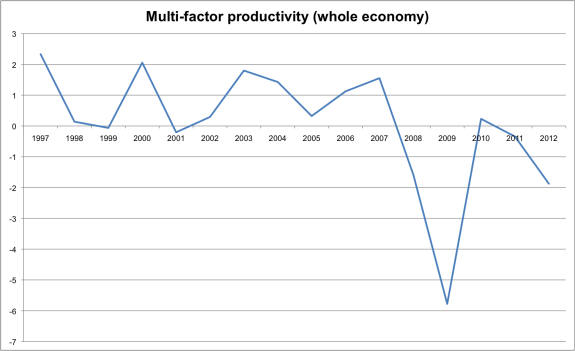
Once I've had a think about possible errors I've made, and corrected them, I will add this to the data section of the Kaleidic website, and update it regularly. I think the chart broadly fits with intuition - fluctuation between 2%-3% prior to 2008, and then crashing into negative territory. Post crisis the rate is noticebly lower than before, with the latest estimate (Q4 2013) at 1.8%

We cannot observe the real neutral interest rate. But we do know that the long run average should roughly equal any actual long run value, and we do know something about the underlying determinants. I think Beckworth and Selgin have made an important contribution. A few discussion points to bear in mind:

  • I've not factored any population changes in, but an increase in working age population should increase our estimate. 
  • I used quarter on quarter growth rates because they lead to less volatile results but Beckworth and Selgin use year on year rates
  • This estimate is a real rate, so shouldn't be compared to a nominal policy rate without correcting the latter for inflation.
  • Beckworth and Selgin are obviously comparing this to a real Federal funds rate in order to get a measure of the monetary stance. The Bank of England's Bank rate isn't the same thing as the Federal funds rate, however, so it might be better to compare the estimate of the natural rate with an overnight interbank measure for the UK. 

UK monetary aggregates are concerning

One of the big warning lights in the pre 2008 boom was when broad money breached a 10% year-on-year growth rate. Since then, however the Bank of England have switched its preferred measure of M4 to M4ex. Can we use the same rules of thumb when the measure changes? I'm not sure. The chart below shows M4ex recently. One of the reasons I've not been too concerned about UK monetary aggregates is that M4ex is pretty stable, growing between 3%-5% since May 2012. 

Indeed if we add the 3 month annualised growth rate (hashed line) it's risen from -0.4% in Feb 2014 to 8.4% just 2 months later (its highest rate in the series).

This morning saw the release of Eurozone M3 data, which you can see below:

After the dramatic slowdown (note: not a contraction) that bottomed out in 2010, it's not just that the rising growth rates haven't been sustained, but have continued to fall. Looking at M3 for the UK we see the following:

The 12 month growth rate was between 2% and 4.3% from Dec 2012 through Nov 2013, but has since dropped dramatically. Despite a blip in Feb 2014 it's now actually contracting. 

As recently mentioned, price inflation is also slowing. PPI is weak and CPI is way below target. Food for thought.  

Capital based macroeconomics is flourishing

Most of the readers of this blog are UK-based non academics. But everyone interested in macroeconomics from an Austrian perspective should be aware of some fantastic new work, seeking to bridge Hayek's insights with the literature on corporate finance. In 2011 I organised a talk by Joel Stern in London - I teach Economic Value Added (EVA) in my classes, and feature it in my forthcoming textbook. But I've not sought to introduce it into my research.

One of the very best books on capital theory is Capital in Disequilibrium, by Peter Lewin. And one of the most productive members of an emerging band of youthful Austrians is Nicholas Cachanosky. So it's really exciting to see the outcome of their collaborations. In particular:

Highly recommended. 

Choose Your Own Financial Crisis

Following the 12th quarterly meeting of Kaleidic Economics, we have released a new report. The main aim of the meeting was to set out a chronology of the financial crisis, and we've suggested 5 distinct phases:

  1. The build up (2000 Q2 - 2007 Q1)
  2. The upper turning point (2007 Q2 - 2008 Q1)
  3. The secondary recession (2008 Q2 - 2009 Q4)
  4. Austerity (2010 Q1 - 2011 Q4)
  5. The BBQ recovery (2012 Q1 - 2012 Q4)

These aren't perfect, and the report offers a commentary. We then discussed a number of key shocks that occurred within these phases of the crisis, and put them in scenario analysis terms by thinking about predetermined elements and critical uncertainties. As a means to enliven the report, I have tried to explain how this type of analysis might serve as a basis for a "Choose Your Own Adventure" type account of the crisis. 

This is a brief report, because much of the discussion was focused on a utilisation of the Dynamic AD-AS model. That is now a first draft as part of this project, please email me for a copy.

2008/09 GDP revisions

Some Market Monetarists have been critical of the Bank of England for being so slow to cut interest rates through 2008. I wanted to look at the GDP figures that we had at the time, to see whether recent revisions are helping our hindsight. One of the difficulties with this is that the ONS only have GDP releases going back to 2009. I was able to track down the releases, and here's what we find:

This is for the quarterly growth rate of NGDP compared to the previous year (IHYO). The green columns are what we know as of May 2014 (based on the second estimate of Q1 2014). The blue column is the second estimate of 2008 Q2, released in August 2008. The red column is the second estimate of 2008 Q3, released in November 2008. So, the post Lehman collapse in NGDP is a lot more evident now, than it was at the time.

Ideally we would be looking at the preliminary estimate, but they don't seem to be available on the ONS website. an alternative (and I appreciate the suggestion from someone at the ONS) is to look at the GDP revisions triangles. If you're not analytically minded, like me, these can look quite intimidating. What I've done is focus on GDP q-on-q growth rates of real GDP (i.e. GDP at market prices, chained volume measure).

The striking thing is the major revisions that were published in the final estimates of 2011 Q2 (released in September 2011). These were then somewhat offeset by corrections for the 2008 figures in the final estimate of 2012 Q1 (released in June 2012), and for the 2009 figures in the final estimate of 2013 Q1 (released in June 2013).

The bottom line is that early estimates of the economy in 2008 understated the problem: 

Whilst early estimates of the economy in 2009 overstated the problem:

What really jumps out though, is the scale of the revisions to 2008 Q3 real GDP.

MA growth rate slows due to "improvement in reporting"

I am busy revising the paper that explains the theory behind MA, and have recently updated the measure. As the chart shows, the growth rate has tailed off significantly in recent months. 

The reason for the drop is a massive reduction UK resident MFI sterling sight deposits that occured in January 2014. Here's a closer look at that series:

The Bank of England have the following note:

Due to improvements in reporting at one institution, the amounts outstanding decreased by £85bn. This effect has been adjusted out of the flows for January 2014.

To show the impact of this "improvement in reporting" I've created MA' which adds £85bn from January 2014. As you can see this explains the sharp fall:

MA' remains in double digit growth. A downside of relatively narrow measures of the money supply is that they are less robust when it comes to these types of ad hoc adjustments. But clearly more details need to be revealed about the precise nature of this change.