Choose Your Own Financial Crisis

Following the 12th quarterly meeting of Kaleidic Economics, we have released a new report. The main aim of the meeting was to set out a chronology of the financial crisis, and we've suggested 5 distinct phases:

  1. The build up (2000 Q2 - 2007 Q1)
  2. The upper turning point (2007 Q2 - 2008 Q1)
  3. The secondary recession (2008 Q2 - 2009 Q4)
  4. Austerity (2010 Q1 - 2011 Q4)
  5. The BBQ recovery (2012 Q1 - 2012 Q4)

These aren't perfect, and the report offers a commentary. We then discussed a number of key shocks that occurred within these phases of the crisis, and put them in scenario analysis terms by thinking about predetermined elements and critical uncertainties. As a means to enliven the report, I have tried to explain how this type of analysis might serve as a basis for a "Choose Your Own Adventure" type account of the crisis. 

This is a brief report, because much of the discussion was focused on a utilisation of the Dynamic AD-AS model. That is now a first draft as part of this project, please email me for a copy.

2008/09 GDP revisions

Some Market Monetarists have been critical of the Bank of England for being so slow to cut interest rates through 2008. I wanted to look at the GDP figures that we had at the time, to see whether recent revisions are helping our hindsight. One of the difficulties with this is that the ONS only have GDP releases going back to 2009. I was able to track down the releases, and here's what we find:

This is for the quarterly growth rate of NGDP compared to the previous year (IHYO). The green columns are what we know as of May 2014 (based on the second estimate of Q1 2014). The blue column is the second estimate of 2008 Q2, released in August 2008. The red column is the second estimate of 2008 Q3, released in November 2008. So, the post Lehman collapse in NGDP is a lot more evident now, than it was at the time.

Ideally we would be looking at the preliminary estimate, but they don't seem to be available on the ONS website. an alternative (and I appreciate the suggestion from someone at the ONS) is to look at the GDP revisions triangles. If you're not analytically minded, like me, these can look quite intimidating. What I've done is focus on GDP q-on-q growth rates of real GDP (i.e. GDP at market prices, chained volume measure).

The striking thing is the major revisions that were published in the final estimates of 2011 Q2 (released in September 2011). These were then somewhat offeset by corrections for the 2008 figures in the final estimate of 2012 Q1 (released in June 2012), and for the 2009 figures in the final estimate of 2013 Q1 (released in June 2013).

The bottom line is that early estimates of the economy in 2008 understated the problem: 

Whilst early estimates of the economy in 2009 overstated the problem:

What really jumps out though, is the scale of the revisions to 2008 Q3 real GDP.

MA growth rate slows due to "improvement in reporting"

I am busy revising the paper that explains the theory behind MA, and have recently updated the measure. As the chart shows, the growth rate has tailed off significantly in recent months. 

The reason for the drop is a massive reduction UK resident MFI sterling sight deposits that occured in January 2014. Here's a closer look at that series:

The Bank of England have the following note:

Due to improvements in reporting at one institution, the amounts outstanding decreased by £85bn. This effect has been adjusted out of the flows for January 2014.

To show the impact of this "improvement in reporting" I've created MA' which adds £85bn from January 2014. As you can see this explains the sharp fall:

MA' remains in double digit growth. A downside of relatively narrow measures of the money supply is that they are less robust when it comes to these types of ad hoc adjustments. But clearly more details need to be revealed about the precise nature of this change.

FRED launches user dashboards

Here's more:

With the overhaul of user accounts, we are proud to introduce a new feature: dashboards. As a registered user, you can now build a personal dashboard that allows you to track your favorite series and graphs. You can publicize your dashboard, so your colleagues, students or blog readers can follow the economic statistics you care about. You can create several dashboards and choose to keep them private or make them public.

Average weekly earnings

It seems very hard to find data on UK nominal wages. Last year Britmouse wrote a post where he attempted to calculate nominal hourly wages relative to per capita NGDP. He says,

The ONS does not have an “official statistic” for nominal hourly wages, but they do publish some data in a spreadsheet in the Labour Market stats, which is updated quarterly.

This can be found by searching for "EARN08" at the ONS. I'm assuming that the reason nothing happens when I click on this is because I'm on a Mac?

Either way, I can't see the historic time series is. So I thought I'd just take a look at the simplest measure from the monthly Labour Market Statistics. The easiest way to find it is by clicking on the unemployment figure on the ONS front page. In the reference tables there's two options of interest:

  • EARN01: Average Weekly Earnings
  • EARN08: Distribution of Gross Hourly Earnings (as above)

Here's the AWE data:

Roundaboutness

The term "roundaboutness" is often used in Austrian business cycle theory, and I'm not sure if it's a simple term being consistently applied, or something more complex. At the recent APEE meetings Nicholas Cachanosky presented a paper arguing that it isn't a mysterious concept (co authored with Peter Lewin), but I'm not sure I'm convinced. My basic understanding, stemming from Bohm-Bawerk is the following:

Roundaboutness = capital intensity. 

Cachanosky & Lewin define roundaboutness as the "average period of production", and use net present value formulae and the concept of EVA to measure it. This is a great way to operationalise the concept, but is it "roundaboutness" that is straight forward, or their method?

One of the reasons I find Tyler Cowen's "Risk and Business Cycles" unsatisfying is because he doesn't really allow for different types of risk. In his treatment "risk" does all the work, and there's no need to talk about roundaboutness. I can't help feel that this fails to do justice to the Austrian story. Hence I am always wary of the following characterisation:

Roundaboutness = Time = Risk.

We can think of the interest rate as a measure of our time preference (or the ratio of the value of present goods to future goods), or a market generates risk assesment. Must they be the same thing? All else equal the longer the production process the greater the risk, but we can conceive of production plans that are risky but immediate (e.g. fashion) and those that are not so risky but distant (e.g. oil wells). In other words risk and roundaboutness are conceptually distinct.

Consider a standard Hayekian triangle:

Now, whilst playing around with these diagrams can go too far, I think they're a good way to illustrate my point. Consider these two alternative ways of treating roundaboutness. Firstly, aa an increase in the production period:

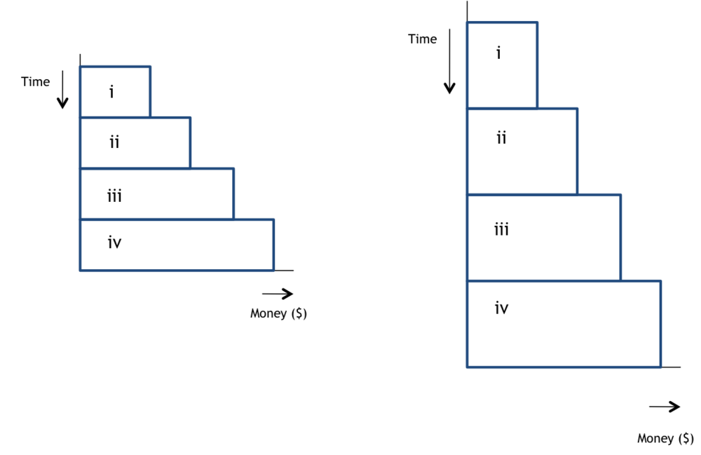
Alternatively, roundaboutness could mean that there's more stages of production:

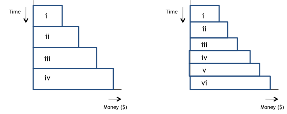
In the example above the final value of the consumer goods being generated is the same, but the value at all stages of production has increased. We could also show this where there's a change in the composition of the value from late stage to early stage:

And so on. It would be interesting to assign some possible applications to show that this is empirically relevant. 

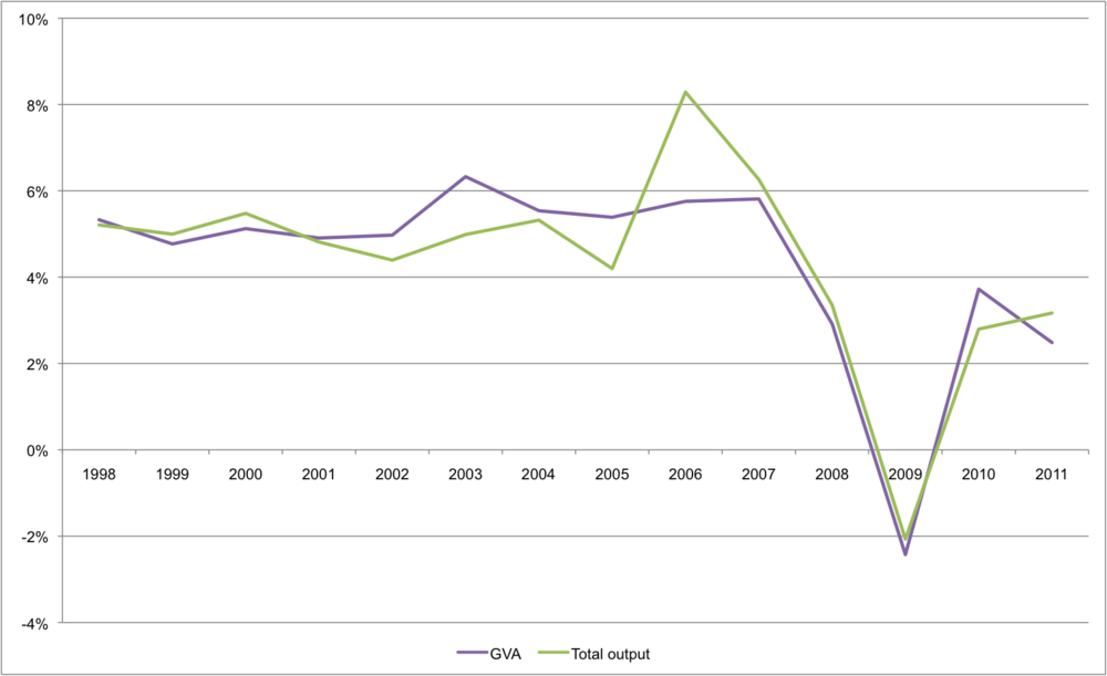
When sketching out these triangles I have in mind Lachmann's notion of reserve assets, which has recently been utilised by Robert Miller with his treatment of "buffer stocks" (here and here). It's hard to measure buffer stocks, and it's tempting to use inventories as a starting point. Here's what's happened to inventories in the UK over the last few years:

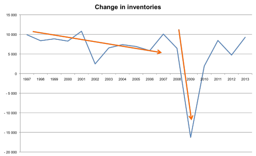
What we (sort of) see here is a steady decline in inventories from 1997 - 2007, which point to two things. Firstly, they get run down because excessive optimism means that entrepreneurs don't feel that they need them. And secondly, the utilisation of inventories as a means to generate unsustainable production (i.e. go beyond the PPF). Then during the crisis there's a dramatic reduction in inventories, and the "recovery" involves rebuilding. We need to be careful though, since inventories are just one source of buffer stock (and indeed one that is particularly close to consumer goods or final stage production). Some examples of buffer stocks include:

  • Inventories
  • Cash balances and other liquid assets
  • Commodities (not only as aproduction input but also as a speculative hedge)
  • Labour
  • Any goods that are relatively less heterogeneuous that others and thus adept at fitting into an array of alternative production plans

Finally, consider a Hayekian triangle and what's supposed to happen when interest rates fall. For simplicity, let's go use a 3-stage version.

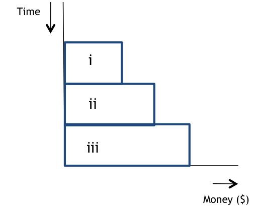
If lower interest rates induce entrepreneurs to move towards more roundabout methods we would expect resources to move from stage iii back to stage i. But stage iii is substantially larger than the early stages. Let's say we shift around 30% of the value in stage iii to stage ii, and likewise from stage ii to stage i. Here's (roughly) what we might see (original is dashed):

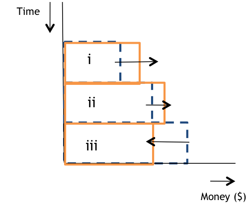
Is it not conceivable that the reduction in stage ii (as a result of activities being shifted to stage i) is offset by the shifted production from stage iii? In other words lower interest rates will cause unambiguous reductions in late stage production, increases in early stage production, but may also swell mid stage production? The stylised facts would be an increase in stage ii.

Gross Output makes The Wall Street Journal

Mark Skousen has an opinion piece on 'Gross Output' in today's Wall Street Journal. Last week I presented estimates for the UK economy at the APEE conference in Las Vegas. You can view my presentation here. The chart below shows Gross Output for the UK economy (relative to GVA):

I plan to revise this shortly when the Supply and Use tables are published in July 2014, so this is only a rough treatment and I've not published the working paper. The data is released as separate tabs in an excel file but if anyboday would like the time series that I've created email me.

I also presented a measure of UK Payments. This also has data availability issues, with January 2010 figures simply missing from the data set. But here's what it looks like:

Bob Murphy on Hayek vs. Sraffa

I confess that I've never read the original sources of the Hayek vs. Sraffa debate, and suspect that it would be worthwile to do so. But I was never convinced that they would overturn or seriosuly challenge my existing understanding of Austrian business cycle theory. I recently read two accounts of the Hayek vs. Sraffa debate, and they validate this.

The first is Bob Murphy's "Multiple Interest Rates and Austrian Business Cycle Theory" (.pdf) He spends several pages outlining Sraffa's critique of Wicksell (and thus Hayek), several more pages discussing Hayek's response, and then even more on Lachmann. He essentially upholds Sraffa's point that in a world of multiple markets there is no singular natural rate of interest - "the" natural rate is a function of whichever good one arbitrarily decides to use as a numeraire. Murphy attempts to solve the problem of whether or not a natural interest rate exists in a barter economy by appealing to a concept of dynamic equilibrium. To be fair he credits Hayek with the basis for a dynamic, rather than static equilibrium construct, but he defines it as the following:

Austrians... should define a dynamic equilbrium construct where quantities, prices, resources, technologies, and even "spot" consumer preferences can evolve over time, but in a perfectly predictable manner

But in 'Prices and Production' Hayek cites "correct anticipation of future price movements" as one of the three criteria for neutral monetary policy (others being constant total income stream, and perfectly flexible prices, see p.131). This struck me as a solution in search of a problem.

In "The Clash of Economic Ideas" Larry White deals with the Hayek vs. Sraffa debate a lot more quickly. He says

Sraffa mistook Hayek's goal, which was not to replicate all the properties of a barter economy, but simply find a monetary policy that would not drive a wedge between savings and investment (p.92)

Isn't that the nub? When Austrians talk about "the" natural rate of interest it isn't because there is only one interest rate, but that there is one particular market that matters for intertemporal coodination. The market that bridges savings and investment. The market for loanable funds. Murphy's 40+ pages of text fail to mention "loanable funds" at all

Sorry Pierro, but I still don't see what the fuss is about.

Bank of England on money creation

The Bank of England have published an interesting note on money creation. Given that Kaleidic publishes our own measure of the UK money supply, there is plenty that could be written about it. For now though, I just want to nip some of the crowing being done by MMTers. The way I understand the "money multiplier" is that there's a ratio between narrow and broad money. It's a bit like saying that there's a link between changes in human generated CO2 emissions and in average global temperatures. But identification of a ratio says nothing about causality. In the case of global warming, it seems that there is a large and vocal group claiming that the ratio (or correlation) is stable, predictable, and underpinned causaility. There's others who dispute this. There's probably even some who argue the causation runs the other way.

In the BoE report they say:

Another common misconception is that the central bank determines the quantity of loans and deposits in the economy by controlling the quantity of central bank money — the so-called ‘money multiplier’ approach.

central banks implement monetary policy by choosing a quantity of reserves. And, because there is assumed to be a constant ratio of broad money to base money, these reserves are then ‘multiplied up’ to a much greater change in bank loans and deposits

And then the killer argument:

While the money multiplier theory can be a useful way of introducing money and banking in economic textbooks, it is not an accurate description of how money is created in reality. Rather than controlling the quantity of reserves, central banks today typically implement monetary policy by setting the price of reserves — that is, interest rates

Obviously this depends on the textbook. In mine, I explain how central banks can affect the supply of money (through open market operations) or the demand for money (through interest rates) and the links between the two. I also mention that there is a ratio between broad money and narrow money. But I don't claim that the ratio is "constant". The term "multiplier" implies some sort of mechanistic causality. I think that's a strawman. I believe that considering the ratio between narrow and broad money, and the factors that cause that ratio to change, to be important.

I suspect that the reason the "money multiplier" is used so much is because it's descriptive and intuitive. The MMT crowd have a grain of truth in their critique. The challenge is to present an alternative that is more accurate but also just as usable. Whenever people criticise "textbook" economics, I wonder if they've actually read any. Or at least if they recognise that textbooks are starting points, and *not* the codification of everything we know and claim to be true.

Welcome to the great stagnation

Yesterday was the 11th quarterly meeting of Kaleidic Economics, and the topic was Tyler Cowen's 2011 thesis on "The Great Stagnation". There is a TED talk with Cowen here. The report is called "Welcome to the great stagnation". All of our reports are here

Here's a chart showing the breakdown of the increases in median incomes in the US, from 1980-2005. The data comes from Steven Landsburg. He shows how median income for all workers rose by just 3%, but that this masks what was happening within different groups. Since women represented an influx into the labour market, and their wages were typically below median, this dragged down the total. But every group rose.

To quote our report,

time series data on median income gives the impression that we’re seeing what is happening to people’s incomes over time, but it doesn’t. It shows what happens to various income groups. This gives a misleading impression if the composition of those groups is changing. It’s like looking at Euston station during rush hour, and noticing that there are almost always 400 people on the concourse. This doesn’t mean that no one is getting home; it just means that for every train that departs, more people arrive. Immigration will continue to top up the lower income group, such that median incomes appear stagnant. But this is a positive demonstration of the dynamic effects of the economy. It’s a strength, not a weakness

Overall though we are sympathetic to the view that the rate of growth in incomes, productivity, and technological innovation has slowed. This doesn't necessarily mean that living standards are falling, since we are getting better at learning how to consume the technologies that we do have. We can be utility optimists but output pessimists. 

Here's our introduction:

This report confronts Cowen’s argument, and considers how it relates to some specific questions relating to the UK economy. In particular, why has productivity nose-dived since the recession? And are lower growth rates, and lower interest rates, part of a “new normal”?

Read the full report here.

Which battle are we fighting?

The second estimate of GDP came out recently, and with it the first estimate of NGDP for Q4 2013 (see Britmouse here, see our guide to UK national accounts here). Once again, the growth rate is strong. Here's the quarterly rate:

Here's a chart showing the quarterly rate, compared to the same quarter of the previous year (series code IHYO):

I am incredibly sympathetic to market monetarism and feel that they have been consistently ahead of the curve. But identifyng a shortfall of NGDP growth expectations as being the primary reason for the recession, does not necessarily mean that a shortfall of AD is the current problem. Obviously, the charts above leave us some way off where NGDP would be absent the recession. But as with most Austrians, I don't believe that this counterfactual is plausible. Even the most monetarist of market monetarists would agree that an NGDP growth rate of 500% is suboptimal, even if anticipated. Austrians think that the same applies (albeit to a much lesser degree) with one of 5%.

The chart below takes a longer look at what's been happening to NGDP (also QoQ of previous year): Clearly, the focus on inflation targets rather than collapsing NGDP was a major oversight by the Bank of England. We'd all be better off if monetary policy was more neutral during 2008, rather than being highly contractionary. What I'm less sure of, however, is the argument that monetary policy is too tight right now. The stable door is open. The horse has bolted. Optimal monetary policy would ignore past errors and guide NGDP expectations towards a sustainable growth path. A level target means that bygones are not bygones when shocks occur, for a given target. But since part of the debate is what an optimal NGDP level target would be, it's ok for market monetarists to be wary of loose monetary policy. 

P.S. This post is focused on the UK economy. The argument that monetary policy is too tight in the Eurozone is a lot more convincing, and it's plausible that deflationary pressures may become a problem for the UK economy too. If it does, I will change my position.

P.P.S I shouldn't have used the term "annualised" in the charts above. I was confused because I'd just been reading Britmouse's analysis, and he likes to annualise the data. There's two reasons why I prefer to look at the quarterly growth rate, relative to the previous year. Firstly, it is publicly available. When the ONS release the National Accounts you can look at Table A2 and there it is. There's no need to do any calculations. This is preferable because it's easier, and more credible. And secondly, it seems more indicative of what's going on. The chart below compares three quarterly growth rates:

  • Quarterly growth compared to previous quarter (IHYN) BLUE
  • Quarterly growth compared to same quarter of previous year (IHYO) ORANGE
  • Quarterly growth annualised (my calculations) GREEN

OK, I've cheated and put my favoured one in a thicker line. But if you want a snapshot of NGDP, I believe this is the least erratic, and most useful measure. It also avoids the fact that I've probably made an error calculating the annualised version...


What's happening with business investment?

On January 1st the FT published a survey of several economics commentators. It's an interesting read and worth spending some time on. One thing that many people mentioned was the role of business investment. The general consensus seems to be that business investment is expected to pick up again in mid 2014, and this is necessary for a sustained recovery. 

I've been attempting to update the "private investment" indicator that Kaleidic Economics publishes, and trying to come to terms with changes in how the ONS report the data. I'm a bit confused, and will look at it again later. But in the meantime I thought I would just focus on business investment alone. 

Firstly, consider the quarterly growth rate:

Business investment is volatile, and to get a clearer picture we can instead look at the quarterly growth rate compared to the same quarter of the previous year:

The dramatic decline in 2009 is evident, as is a spluttering rebound with recent figures being very weak. Perhaps the slight upturn we see in Q3 2013, together with more optimistic GDP forecasts for early 2014, will result in increased business investment. But what constitutes a normal rate? The chart below takes it back to 2002. 

It isn't clear what an appropriate growth rate should be, for a balanced economy. Indeed the chart below shows the absolute numbers, with the red line denoting the median level. So what are we waiting for?

Transport equipment volatility

The chart below shows investment in "Transport equipment" from 2007 to Q3 2013. It is a lot more volatile than it has been previously, with an especially large increase in Q4 2012. 


Here's the raw numbers, showing that the spike in growth rate is the result of being at a low base. This is because of a large decline from Q4 2010 to Q1 2011. 

Does anyone know the detail as to what was driving this?

UK unemployment

There's lots of talk that UK unemployment is falling faster than expected, and the Bank of England have brought forward their forecast that it will first fall below 7% from 2016 to 2014. As the chart below shows the rate has steadily fallen since late 2011.

But this is also a nice exercise in the importance of time frame. Here's the same data from February 2009 (i.e. the month in which it went above 7% for the first time)

And here it is going back the last decade


I'm using UK unemployment rate aged 16+ (series code MGSX)

MA takes off

A belated update of MA reveals that the money supply in October jumped to a growth rate of 12.99% (compared to October 2012). The growth rate had been consistently between 7% and 8% since April 2013. This gives further evidence that the UK economy is picking up speed, and perhaps too much. More details in the data section.

(For some reason Google Drive seems unable to show charts, so I've copy and pasted the data into Excel and saved this as an image.)


The Yakiniku recovery

Last week saw the 9th quarterly meeting of Kaleidic Economics, and the topic was low growth scenarios, with a particular focus on Japan. 

In the paper we discuss the conflicting debates about the extent to which "the lost decade" is a myth, and whether this is a result of too much, or too little, policy response. The table below shows some typical literature, and interestingly demonstrates that even within the scame school of thought, there are differences of opinion.


Policy response

Loose

Tight

Lost decade?

Myth

(i)

?

(ii)

Kelly (2011)

Krugman (2013)?

Reality

(iii)

Powell (2002)

Shostak (2013)

(iv)

Krugman (1998)

Greenwood (2006)


Readers may also be interested in the chart showing Japanese GDP per capita relative to Germany, throughout the so-called lost decade [via http://www.tradingeconomics.com/]:

You can read the full report here.