In George Selgin's classic book "Less than Zero" he advocates the concept of the "productivity norm". He argues that:
"the price level should be allowed to vary to reflect changes in goods' unit costs of production"(p.10)
A productivity norm exists when adjustments in the general price level follows the rule above, and has the following implications:
- Changes in velocity would be offset by changes in the money supply such that nominal income is unchanged
- Changes in productivity would be reflected by changes in the price level such that nominal income remains unchanged
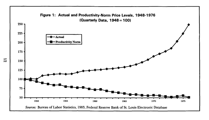
Here is the chart from the book, showing the Actual and Productivity Norm Price Levels from 1948-1976:
 There are several problems with attempting to replicate this for the UK. It may be that these problems are insurmountable, and it may be that my attempts to deal with those problems have created new ones. Still, this is a work in progress and I am looking for feedback.
The first issue is that the productivity norm rests on Total Factor Productivity. The best source of estimates for this come from the following ONS release:
- "Multi-factor Productivity, Indicative Estimates to 2012", January 23 2014
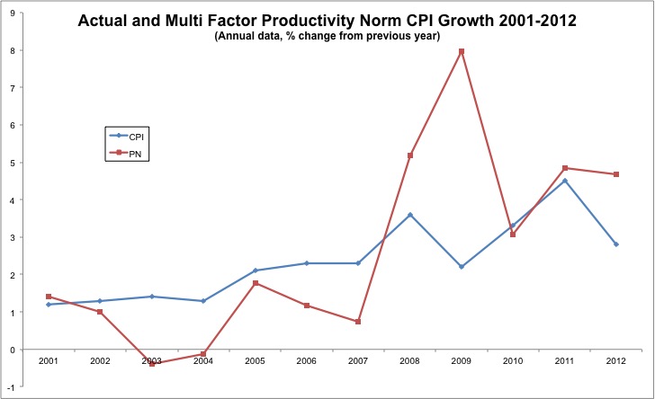
These are only annual figures up to 2012 and supposed to be treated with caution. Given that I'm not careful with data anyway, I thought I'd use it. The chart below shows the results:

The method of calculation was simply:
 What this shows is that productivity gains should have generated a benign deflation in 2003-2004, but also that policymakers should have allowed inflation to go higher during the 2008-2009 crisis than they did.
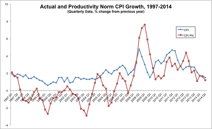
I also wanted to look at more reliable, and quarterly data, and therefore used Labour Productivity (I was bouyed by Scott Sumner's claim that the difference between Labour and TFP isn't all that important). The chart below shows the growth rates from 1997-2014 using the same method as above.
 Once again we see several periods where positive inflation appears too hgh, with several points at which a productivity norm inflation rate would have been negative. It then spikes up significantly higher than actual CPI before coming into line more recently. Given that the productivity data is only available quarterly this doesn't incorporate the 0% CPI we have seen this month. Because I suspect this is the most interesting of the charts presented here, this will be the one that we update regularly in our data section.
Finally, my original goal was to do these calculations looking at levels. I used the following method for the first time period:
 and this for each subsequent:
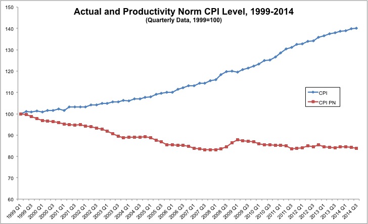
 Here is the chart:
 It is telling us something interesting, but I'm not sure if the narrative is supported strongly enough by the theory and methods employed.